Metadata embedded in last image. I know, terrible quality, I'll have to do some learning about all the foreign terms: ISO, Fstop, shutter speeds....
Sunday, 12 April 2015
Friday, 10 April 2015
Assignment 11
Process Used to create logo:
- Created new PS file 256 px X 152 px with transparent background
- Added Text, Used similar colour to background
- Added Layer styles including drop shadow, bevel & emboss, played around with opacity
- Saved it for web as .PNG 24 bit.
I see in the final image that I could have reduced the opacity more to give the logo a more to say 85% to give it a more "ethereal" sky feeling but after zipping up the folder and being conscious of when the next assignment is due, I decided to leave this as is. Will experiment outside the bounds of assignment time pressures.
Played around with moving the drop shadow and changing colours of text. I think the first logo is more striking but the drop shadow effect on this one is good.
Wednesday, 8 April 2015
Assignment 10
Why I Like? - Colourful, vibrant and engaging with "happy" colours. Message of the site is conveyed in all aspects of the background design: the swirls on the top suggest movement and the colours are bold and energising.
Why? - The background is not the most interesting but as the subject matter is serious, I think the background plain blue design is appropriate for a more sombre approach and the calming, light blue reflects the waterways and oceans which this website is concerned about. One of my favourite causes.
Why? Interesting, unusual pattern with psychedelic mix of colours and swirls adds interest and engages viewers. The dancers on top also move as you scroll through the website. Not sure if the text of the company logo and the rest of the text matches the background - but still, I like the eclectic mix of styles.
Process used for 2nd background image - I thought the process used for the 2nd background was correct but it yielded such a dreadful outcome. 1st I reduced saturation of image then I cropped to remove the white border then I increased bottom canvas size to make a uniform colour (there was no natural way to have any of the borders fade into a single colour). Added a new layer and applied the gradient (transparent fade) on the new layer and dramatically reduced opacity of top layer as the gradient was too much.
Q3. THIS IS NOT VERTICAL - I think you either have a wicked sense of humour or there was a mistake. Horizontal Repeating Screenshot (I used snipping tool not Greenshot. I'll explore this soon. So many new things to learn. It's overwhelming to do too many at once) of thin jpg repeating. I copied and pasted my PS image over the one in the M4 file. I would have preferred not to have a black background. Still, you would not believe how many hours this took for me to achieve!!!
Q3 & 4.Resubmitted images. Final seamless tile of dirt is best by far. Notes from previous include: Basic design to start with. I note distortion in centre of file not sure how to remedy this. I tried with another mosaic wallpaper design to create a tile but encountered a similar effect with distortion/lack of alignment in the centre of the tiled background. Finally, I chose another design from wallpaperdirect which would overcome the centre distortion. See below screenshot. Tiled backgrounds are easy to create (if chosing existing digital image) but alignment in certain patterns needs to be considered when the tiled background is put together.
Monday, 30 March 2015
Assignment 9
File Sizes - JPEG image = 303 KB, GIF 256 colours = 834 KB, PNG 24 = 2.086 MB. JPEG file chosen for use in web production as much smaller (almost 1/3 size of GIF) than other two formats.
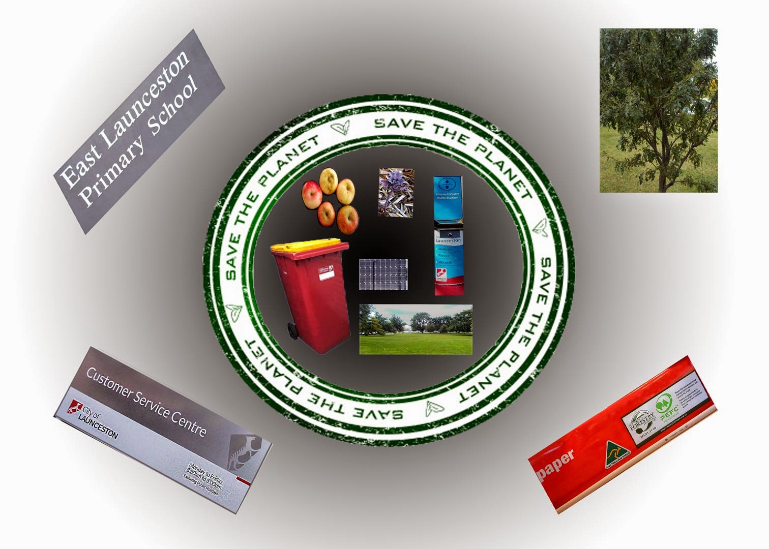
Design Format - Background colours representing space or oceans (blue) and green rim (earth) were chosen. Photos relating to practical, everyday ways to help the environment were included in the inne rim while photos representing factors relating to government (city council), education (school sign), industry (recycled paper compliant with sustainable forestry practices) and earth's natural resources (tree) were placed outside the rim. I played around with layer effects but decided to hold off until I've learnt more about how to use it properly. I could not quite get the drop shadow effect I wanted.
Below is my first draft at the image design.
Revised Image - radial gradient applied.
Resubmitted with attention to design aspects such as hierarchy, flow and colour consistency. All photos in circular area and underlying shape pattern over them used to indicate their relative similar importance. However, the bigger images attract nore attention but I hoped to balance that out by where I placed them. I think I'm getting there.
Thursday, 26 March 2015
Assignment 8 - Cert III Media
Detailed Image - File size is 4.59 MB
Simple Image - File size is 3.93 MB
Why is file size different? File size is greater in the more detailed image than the simpler image because while the camera used has captured the same number of pixels for both images, there are a greater number of bytes used to encode each pixel in the detailed image. A greater number of bytes are needed in the more detailed image as there is more detail, greater colour and tonal range and greater transitions. File size is determined by the total number of pixels x total number of bytes used to encode each pixel.
How does this influence the way you take photos if your brief requires relatively small file size? What sort of backgrounds should you consider if your client needs small files?
For small file size you would aim to use background of one solid colour with no features (i.e. detailed patterns or markings) or colour gradients (especially multiple colour gradients), tones or blurred edges. Neighbouring pixels need to be as uniform as possible.
City Car - A suitable background for a shot of a modern " city car " that had to go into a web advertisement may be a plain white background which is colour-matched to the white of the car (minimise tonal range further). This would be aesthetically pleasing given the black in the car body would contrast nicely. A solid red or green or blue background would also be suitable. Note large, featureless background compress better (i.e. less bytes needed to encode each pixel)
Unsuitable backgrounds may include backgrounds made up of lots of different types of colours, colour hues and tones and having lots of detail such as background made up of of paisley patterns or a tree with lots of leaves of different colours. Finally, for a retro car advertisement, a minimalist background would be more suited to the product.
Tuesday, 24 March 2015
Assignment 7
Assignment 7 - Took some creative licence to use my favourite running shoes instead of me as the clone. I'll try next time to use the Edit - align images option for creating a layered effect. I see now I should have adjusted the exposure separately for the last shoe in the series. Still, my skills are increasing.
Resubmitted Image - I realise that because I tend to enlarge the image when I am working on it in PS that I overlook the kerning effect. I'll ask you about how -other than by looking at the text - one can accurately assess the distance between letters. It's not that obvious to me when letters are irregularly spaced apart. You can see I have still not got the light to be authentic on the individual pairs of shoes. Not for lack of trying!
Saturday, 21 March 2015
Assignment 6 - Cert III Media Digital Imaging
Assignment 6 Despite the help, this was a huge struggle. Shadows and highlights not right. Will have to revise layer effects. what a relief to submit this.
Resubmitted Image - Image with back window panel adjusted and side panel improved some what as requested. I'll practice "tidying up" my images. Just give me a bit more time.
Subscribe to:
Posts (Atom)


